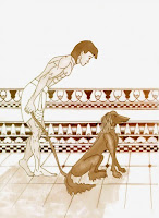
I finally have some time to type up my draftsmanship notes. I took the class this year Thanskgiving Weekend and last year.
Here we go:
Perspective relates to everythign you draw. The magic of of drawing is to take a flat piece of paper and make it appear 3 dimensional.
Perspective should not be a bad word - it is nonsense to think you don't need perspective.
Raphael uses cross contour lines.
Nicolaides - "Natutal Way to Draw" has 750 hours of exercises - gesture drawing - cross contour, threads, adhesive, he doesn't take into position the camera angle.
There is an idea of dipping up or dipping down which puts a rubber band around an object depending on eye level.
Definition of Draftsmanship: Creating an illusion of a 3d world on a 2d surface.
Drawing is the foundation of realistic painting. Rush-Bliss-Fall inlove with Drawing.
Get out of your mind into the paper. Probem is how to get stuff out of your head onto paper.
Animators know how to do this. They trace over and add technique and style.
To get good at draftsmanship it takes 2 to 3 years of hard work to not be bound by reference.
How do artists invent?
- They make complex figures from simple forms
- Stanislav Szukalski was fanatic about not working from the model
- but you need to know something about anatomy (it has to be in the subconscious mind)
- This is not an argument against models
- In order to get to a high level you need to work on the right things
- Core shadow and reflected light is the halmark of inventing out of the imagination
Jon Gnagy (artists correspondence corse)
- you start with a stick figure based on anatomy
- you start with shapes and then go to the next level (forms)
1. Cones, cylinders, spheres
2. No core shadows or reflected light
Rib cage and pelvis are important to rendering
1. Start with Mannequin
2. Blocks and Cylinders
3. Add sophisticateed Anatomy
4. Plan rubber bands to know if we are looking up or down
5. Head is a coffee can with a rubber band around it
6. Head is both roundish and squarish
Secrets of Draftsmanship can be found in the old dover books by Bridgeman and Pyle
- Learn the simple forms (draw blocks and cones)
- Master the simple forms
a. Spins a box
b. Tilt a Cylinder
c. Assemble simple forms and then shade them
Image Systems
- every Shakespeare play has an image system
Learning to Spin a box is an exercise worth 2 months of work because everything is based on a box.
Problems you will run into
a. x,y,z will converge or be parrallel
b. fear of Foreshortening (draw boxes and dare to foreshorten)
c. Inconsistent Convergence
When you finish this learn to tilt a cylinder
a. remember ellipses have major and minor axises
Assembling simple forms
- cross contours are lines from simple forms
The body as architecture
Leonardo da Vinic and Durer understood form from three points of view, they worked on measuring the body
- you study form so we can tip them and treat the body as architecture.
- treat the head as if it has awnings and sills
- beautiful line
- break up planes
- control specular highlights, core shadows and cast shadows (some people's nature pushes them towards tone)
Next Stage - Self Consciousness/Inhibition
(try not to create anymore masterpieces)
- you will have to go through a period of discomfort and disatisfaction
- you may feel like you have lost your talent
Draw on the Left Side of the Brain
Sphere -
planets, molecules, eyeballs, dandelions
the sphere is also a transitional form
Spheres and Ovids (egg shapes) will solve all kinds of dilemmas
Classic draftsmanship on spheres is a test of mastery - they are not intuitive
Gary Fagin p. 237 "stripes on beach balls, rings on barrels . . . lips on a smile
An ellipse is a circle in perspective it is not an oval . . . it is also not a fish or a racetrack
It is symmetrical top to bottom and left to right
Draw freehand ellipses. Draw everything as if it is made of glass and has a (band?) around it
Accuracy vs. Control
- the worst way to start drawing is carefully
Nicolaides said we must work on the blood of art and feel the feeling as you move in empathy. Rehearse the guts of art.
Effortlessness
- start out loosely
- gradually refine
- acquire infallible technique
- open yourself to inspiration
Books
"Lessons from the Great Masters" (Hale)
"Natural Way to Draw" (Nicolaides)
"Master Class in Figure Drawing" (Hale)
"Creative Perspective" (Ernest Watson)
Scott Roberston Gnomon DVDs
Draw 123
Artists
Ken Hodges
Stanislav Szukalski 1893-1987
Heinrich Kley
Bernie Wrightson
NV Wyeth
Vance Kovacs
Durer
Bridgeman
Burne Hoagrth
Drew Struzan
Cambiaso
Charles Le Brun
Leonardo da Vinci
Linedecker
Mucha
Gary Fagin
Don Lagerbird
Windsor McCay
John Goodinsen
Paolo Uccello
Rubens
Alonso Cano
Tintoretto
Parmigiano
Arthur Ranleham
Rick Griffic
Sunday, December 27, 2009
Monday, December 21, 2009
Amazon vs Barbarian Workshop - Karl Gnass
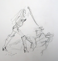
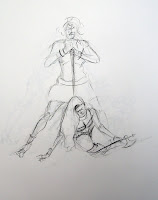
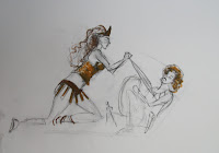
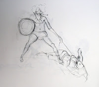
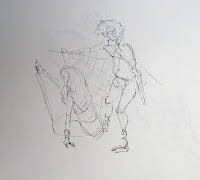
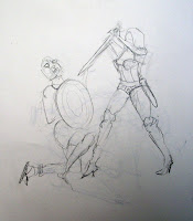
Karl Gnass said at his workshop on 2 Figure Composition that the most important thing in a drawing is the story. You can net it out like your paycheck.
Start a drawing out with long lines of action. Don't try to force one line - it's an artifical endeavor. You need a rhyth,oc relationship between lines that keep it as simple as possible.
UNITY - does not need to be harmonic - can be dissonate. Out of balance doesn't mean lack of unity.
HARMONY - too much harmony is stasis although it can represent the sublime - but it is not a good story. A story with absolute harmony means that there's not much happening. How compelling the struggle is. Homostasis. We don't care anymore until that moment there's an excitement of getting things back in balance.
HARMONY and BALANCE don't make it unfied. No unity - no picture.
Two figures need to be unified - need to find lines into the whole story.
POUSSIN may have a zillion figures in his paintings/drawings but they work as a whole - a physical unity - but there also may be an emotional element to it.
What you are drawing is an idea not just what you are seeing. This is what the CUBISTS were doing. They are depicting the physical - there's more than what you see with the eye.
Every point of view is a subjective point of view. Every choice you make is a choice. So then why not make an interesting choice. Don't use short cuts.
Remember long lines of action - remember the x,y and z axis.
Points attract us like bullseyes. Iconic work like Pre Renaiisance Art reflects the oriental aspect of art.
The Renaissance wants to get out of the square - thinks about golden section or the sweet spot. It is the difference between self reflection and taking a walk.
Don't change by exaggeration instead heighten the pose. Exaggeration for Karl Gnass is just style.
Think of
a. Lines (lines of action and direction)
b. Surface (surface has up and down, right and left, but it doesn't take us out)
c. Volume (unity, as well as, space)
Negative space has characterisitcs.
Michaelangelo's Last Judgement has Parralels on a different plane
TIMING
- think about if you had an artist set up the telephone poles in a city
- feel some things faster and some things slower
- figures on a stage with shifting movements
Giotto experimented with movemt
Look at greek and roman friezes and egyptian hieroglyphics
Start to feel movement not copying - use the figure as a point of departure
Be aware of the ground plane. We have an up side and then we have down and around.
- find movement and rhythm
- the more horizontal the figure is the more defeated the figure is
- work on an abstract level first
- have forward and back
- try not to have everything lined up on easy planees
- up and back on diagonal
Composition is more than design - it tells stories
Good design tells a story from a distance (simple, clear, grabs the eye)
Refine things in terms of their relationship to each other
Don't create tangents but instead tension relationships
Remember the relationship between the edge and another edge
Remember the sacred structure, sweet spot and the golden rectangle - Use them.


