Sunday, May 30, 2010

Head Drawing

Went to head drawing last night 5 to 8pm at 3 Kicks Studio with Glen Orbik. This was my second class. I realize I really need to work on this a lot. I don't remember my proportions on anything very well even though over the years I have taken head drawing at Otis, with Mark Westermoe and also at the union with Karl Gnass but it was been over a 10 year span and not that consistent. I think I will have to take this class three or 4 times to figure out what I am doing.

This is the long pose I worked on. The nose is weird and also the mouth. I feel like I may have too much forehead too but I am not sure right now. I need to go through the Loomis book and copy drawings. I am going to look at the Glenn Villpu dvds I have on the head as will as the Bob Kato ones from Gnomon.
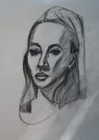
This is the tracing paper overlay that Glen Orbik did over my drawing. You can see how good he is. Mark Westermoe used to put the tracing paper overlays over our drawings and fix them too. I think it is a method that they must have learned from Fred Fixler who the both studied under at the California Art Institute.
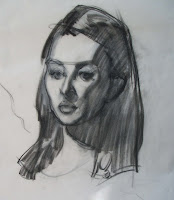
This is a basic lay in the Glen helped me with. He is great in the class he gives you lots of attention.
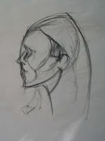
This is a 5 minute drawing I did. I tend to be really heavy handed with the charcoal. I need to do some pressure exercises.
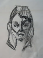


This is another 5 minute drawing. I need to work on these and go somewhere and draw this week but I also have Cathy's class so maybe when her class is over and I will just concentrate on watching the dvds and copying from Loomis and doing the head mapping
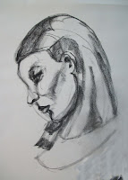


This is a quick sketch will the model was on break.


Class Notes:
Keep everything light.
First get the big shape, brow, center line, base of the nose. deep eye set, shape of the nose and then keep it light.
Map out the planes of the head. Put in relationships.
1st phase - Figure out where everything goes
2nd phase - Figure out dark and light shapes (think of it as a crappy xerox)
The drawing is supposed to be what you see when you squint.
Get rid of construction lines
The eye lashes and eyes are part of the same dark shape/
Relate everything.
Posterize light and dark in the hair. And use a big stroke in the hair as a suggestion of texture. The last thing is the extreme darks (or Glen says dipping into the black paint).
Either you are blocking in or honing in. Don't outline features outline the light.
Squint your eyes until you see a shape or a puzzle piece.


Friday, May 28, 2010

Thursday, May 27, 2010

Hippie Musician - Steve Brown


Did these about a month ago when Cathy was ill and Steve took over her class.


Cathy Karol - Man with Stick


Cathy liked these drawings. I hadn't scanned them before.


Tuesday, May 25, 2010

First Head Drawing Class - Glen Orbik

Had my first Glen Orbik class. I felt like I was drawing with my left hand - I hadn't thought about tone at all. I didn't remember the proportions of the head. I felt totally lost. Glen was a great teacher, he was patient, got around the room a lot and did a great demo. I am confident I will get better in this class. He teaches drawing as if you are painting he calls the charcoal pencil the brush. He calls the charcoal the paint. It was an incredibly interesting class and it went 5 to 8pm on Satuday night on my 40th Birthday.


Hollyhock House

Here are some 6 x 8 paintings I did of the Hollyhock House at Barnsdall Art Park on Friday with Mary Beth.


Thursday, May 20, 2010

Cathy Karol - Santa Monica College - Female Cylinder Lesson


These are drawings from last week where we worked on the cylinder using Glenn Vilppu's method. I think the came out pretty well.


Cathy Karol's Class - Santa Monica College

Did a lot of different exercises at class last night. We worked on the body as made up of cylinders. We also played with adding many arms and heads inspired by Indian sculpture and paintings.


Camels at Living Desert

I did these sketches at the Living Desert 5/3/10. The camels are both male: named Clyde and Gulliver.


Monday, May 17, 2010

Erik Tiemens Workshop - Concept Design Academy

Erik Tiemens often paints on Hot Press paper. A lot of his work is dominated by blues and browns. He says you don't need a lot of color when you are doing a tonal comp. He lets his medium be loose. His materials of choice are gouache, ink and watercolor on tone paper.

He also uses blocks of watercolor papaer. He focuses on negative and positive shapes. He suggests that you shouldn't get bogged down in details. He says when he was younger he used to do very detailed line drawings. He also has done a lot of master copies. He like Zorn. He also liked to make color paintings from black and white photos as an exercise.

He has a warm up sketch technique were he explores different compositions rapidly.

He likes the California Regionalists - Emil Cosa. They capture vitality and regionalism.

He thinks painting from life helps build the artist.

He likes to paint in the afternoon because there is more contrast.

He suggests trying different formats.

He paints in his car. He pushes the brushstroke in his digital work. He uses the dimensional oil painting brush in painter. He also says he can build up a set in sketch up and then move it to painter or photoshop.

Oil Painting Influences are Constable and Turner. In those days you would do a series of paintings at once.

He mentioned Bill Perkins as an influence.

He says if you aren't painting in watercolor or gouache that limited palette sketches in markes is a great way to learn.

He plays with painting really soft because sometimes pencil drawings make you seize up. He likes to do paintings with Prussian Blue and Black. He mixes watercolor and gouache.

His art process can be very experimental - scubbling, rinsing brush and drying it off, pull highlights, build up darks.

He starts his paintings starts rough and moves to more solidified.

He likes Linsky Hair Brushes (6-8 fine tip) that he gets from Blick also Windsor Newton Series 7

He uses big brushes to block in and uses filberts to suggest people, animals and old boats.

Art History Influences

Albrecht Durer (he mixes very detailed with very loose)
The Dutch would sketch outside and draw outside and then oil paint in the studio.

Corot - tonal sketches with gouache and chalk

the Dutch Masters had a concept of the sublime in the landscape. They would travel to Italy and create a huge portfolio

Bill Perkins Workshop


Attended Bill Perkins workshop on Sunday at Brandt Library and Art Center. We drew Notans and Painted a model named Tony who I have drawn before twice.

These are notans done with markers on post its.


Notes:
Bill Perkins quoted Loomis - "If it's worthy of painting then it's worthy of planning."
To avoid mushy paintings use 5 values based on what you're painting.
He gave us markers and post its (see above) and told us not to render with the markers but choose the closest values and make simple shapes. This will create clarity in the painting.
Eliminated the in between values - don't paint them - this will let your painting have clarity.
Before you paint describe to yourself what you are seeing and what you are about to see.
Don't use names don't say tree use adjectives. Because if you say tree you will think generic tree and stop looking. Don't be so anxious to paint that you don't think about what you are painting.
Think about "beautiful color." Think about the beauty in the color that you are seeing. This will make you work in a certain way when you think about the beauty in it.
1st - Simple Value Groups
2nd - Design and Composition (no composition rules explain every situation. What you see and what you want to say you can bend reality to gve it presentation you want).
Sketches help you with tonal clarity and help you figure out how to bend the rules.
Every painting as a exposition (beginning), midle and end. Visual tension helps you resolve your image. In your sketch find lightest light and darkest dark - not rendering.
Notan vs Chiarascuro
- figure out if what you are creating/painting/drawing is more dominated by light and shadow or light and dark this is Notan vs. Chiarascuro. Sometimes you don't need to add more form.
Think of the relationships between light and value.
Howard Pyle said there are two values in everything
Serroyo has greater contrast in the mid values
A lot of photography in magazines is shot in Noan (flat light)
Can play with both - Sargeant simplified black suits of men but had mid values in their faces.


Friday, May 14, 2010

American Stories: Paintings of Everyday Life (1765-1915) - LACMA

I saw the "American Stories: Paintings of Everyday Life, 1765–1915" at LACMA a couple of weeks ago before I met some friends for dinner at the Farmer's Market.

What I mainly learned is that I am in love with Winslow Homer. Here are two paintings by Homer that I love.


Cotton Pickers

The Veteran in the Field

I also like George Bellows a lot. I remember doing a paper on his painting "River in the rain" when I was at RISD. My teacher whose name I have long forgot told us to visit our painting everyday to get to know it. I loved that teacher and I did just that.
There were lots of paintings with African-Americans in them which really surprised me. Not so many African-Americans at the exhibit (only me) when I went to see it. There were a lot of Cassatt and Eakins paintings I remember seeing in my childhood at the Philadelphia Museum of Art.