Showing posts with label concept design academy. Show all posts

Sunday, June 13, 2010

Environments and the Wacom


Here is my first assignment it took me forever . My hand started to cramp also. It still works. I think I am too old to learn to draw on the computer. But here I did it. Some of it looks good some of it not so good.
I learned a few things about photoshop - the skew tool, when you hold the shift key you can make a straight line. It was so hard!!!!

Sunday, August 23, 2009

Color Workshop - Nathan Fowkes - Concept Design Academy

I went to a color workshop with one of my idols - Nathan Fowkes. I love his landsketch blog. His paintings are amazing - they about the most beautiful paintings I've ever seen.

So what did he say? Here we go .......................


Color can be used to reach people at a gut emotional level.

He suggested looking at Paul Lasaine. paullasaine.blogspot.com. He said he is painterly with good drawing and good structure.

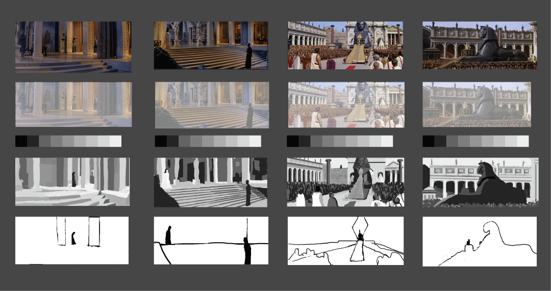
NF's (Nathan Fowkes) first job in Animation was on the Prince of Egypt. He thinks he was hired for his painterly style. He was assigned early on the color keys for the Royal Banquet Sequence.

(color keys are small loose paintings w/ info for the final frame)

NF said what he had to offer was his understanding of "Unity with Variety"

UNITY (stable, predictable, repetitious, boring)
VARIETY (surprise, out of the ordinary, unpredictable, uncomfortable)

NF said "Variety is the spice of life but Monotony provides the groceries)

Unity are colors that are closest together on the color wheel.

Most colors in nature or neutralized.

If something is boring then add contrast.

Sometimes triads, complements that have too much variety can become garrish.

The definition of garrish is too many things that don't relate to each other.

He said he grew as an artist by copying James Reynolds everday. You have to be commited.

NF talked about getting so familiar with something.

NF talked about cools and warms placed against each other.

He talked about El Dorado and Spirit.

He talked about Sinbad where a green interior contrasted Sinbad's red costume. How Sinbad was in red but the city people were in blues and made from straights and curves. Sinbad had many sharp angles.

NF talked about in Shark's Tale that the main character is golden orange because he is in water and water is blue thus he stands out by being the complement.

COLOR HARMONIES

A color harmony needs a story point

How do we push harmonies towards emotions?

METAPHORS
- I was feeling blue
- Green with envy
- A white lie
- A black mood

A single color can hit us at a gut emotional level. Colors can be likened to music with major and minor keys.

A color was
1. hue
2. saturation
3. value
4. temperature

These four things are used to create contrast.

As artists we need to get competent in using colling to pull out emotional beats.

There is shape language and color language.

He talked about how color can have different meanings. For Example, green can be a color of nature but can also me poision or unearthly.

An ashen/gray can be lifeless or sterile.

He talked about how blues and greens together can make a contempletive space.

Every time we make artwork we should ask ourself "What emotional response do I want people to have?"

NF talked about lighting and light on form. Need to study how colored light refects on surfaces.


He suggested looking at graphics.ucsd.edu/~henrik/images/

He said you can't understand color until you get outside and landscape paint.

NF mentioned Ron Lucas he said look at ushuaia.blogspot.com

NF talked about an animated version of Moby Dick that he did development on but didn't go.

He talked about color scripts and beatboards.

He mentioned people either do characters or environments you need to push your book towards one or the other.

He said he basically uses Photoshop but at Lucas Film they use painter.

He says we have a tendency as humans to notice details - but an artist has to give that up and learn how to make big simple statements.

And he said a lot more . . .

Artist Mentioned by Nathan Fowkes

Paul Lasaine - paullasaine.blogspot.com
James Reynolds
Susan Lyon
Craig Mulline
Scott Wills (Samurai Jack)
Ron Lucas
Zorn
Sargeant
Feng Ju
Stephan Martiniere
Klimt
www.graphics.ucsd.edu/~henrik/images
Ron Lucas - ushuaia.blogspot.com
David James
Scott Wills

Sunday, August 16, 2009

Union Station - Quick Sketches


These are some quick sketches from Union Station field trip last week.

Analytical Figure Drawing

I'm a little confused about how the shoulder blade and arm work on the drawing on the left on the model's left arm.


All in all, my drawing today seemed to be a little better than last week. Last week I felt very stiff because I had taken 2 weeks off for vacation. It seemed to really show. This week I wasn't as rusty.

Feet

We worked on drawing hands and feet today in Analytical Figure Drawing Class at the Concept Design Academy. Kevin said feet and hands basically have the same structure. He said the big toe points up while the lesser toes point down. He said we should treat the foot as a box. He also went through some proportions.

Here's Kevin Chen's drawing of the foot put next to my drawing in the same position. I clearly have a lot to learn. I'm missing the weight on the toes as well as the clean geometry of the foot. Kevins attachment between the leg and the foot is very clear while mine is messy. I'm also still drawing too dark.


Hands

Kevin stressed today that we treat the hand like we treat the face because they are both very expressive. He said the pinky, thumb and index fingers have a lot of character but the two middle fingers can often be treated as one because they usually work together. When the fist is closed the palm is smaller than when the fist is open.

He also reiterated the use of straights vs. curves. On the hand there is always a straight side and a curved side. The fingers are straight in the middle and curved on the outside. The palm is not flat but has a slight arc. The arc is only gotten rid of by external force - which pushes a fat pocket on the side. On the hand and fingers the bottom is fleshy and the top is boney. He quoted Glenn Vilppu stating there is a flow from the arm to the middle fingers - if you don't draw it the arm will seem broken.

When drawing the hand it's not that important to have a lot of information on the inside it's important to have good design on the outside. Kevin said to study animation drawing to understand the hand. Kevin also told us to be aware of making the fingers too sausagey. He said to think of the finger as a box.


I've never really heard anything that I can remember about the proportions of arm and hand. Today, Kevin divided the lower arm into thirds. And then the 1/3 measurement could be used as the measurement of the palm and that measurement again with the same distance from the palm to the top of the figures. He also talked about the thumb coming out a 45 degree angle.

Arm Studies


Felt really lost with these arm studies. I need to work on this a lot more.

Friday, August 14, 2009

Hymn of the Pearl

Thumbnail of the kennels
First Layout

Perspective Overlay
Detailed Line Drawing


I've been working on a graphic novel called the Hymn of the Pearl for several years. The middle of the story is partially inspired by the biblical Joseph story in Egypt. The hero, Gaspar, once a prince is now a slave in the Royal Kennels in Alexandria. At a certain point during his stay in the kennels, Odjit, the kennelmaster's wife, seduces Gaspar which leads to Gaspar's imminent downfall at the hands of Remmao, the kennel master. Before Gaspar is punished by Remmao, a shapeshifter, Neshera - part woman, part eagle rescues Gaspar from the kennels and his enslavement in Egypt.


These sketches are of Neshera, in Eagle form flying into the Kennelmaster's estate. The building in the foreground is the kennels. To the right is the family temple (chapel) The building behind the kennels with the awnings in the kennelmaster's mansion and the building in the top left is the workshops and servants quarters.

I did this as part of the work for Ed Li's Sketching the Environment Class at the Concept Design Academy


Tuesday, August 11, 2009

Kevin Chen - Analytical Figure Drawing


I think I learned a lot in Kevin Chen's Figure Drawing Class. He expresses the figure in a way that I'm not used to at all so at first I felt very lost. I'm going to take the class again. Right now a lot of my drawings are confused and robotic but I think I will get better next time. I hope I do. The class is very good because it is action filled with attention and lots of hand outs and demos.


Here is some work I did in the class. I'm not proud of it. I just want to get it up there so I have something to compare it to a year or so from now.

Monday, August 10, 2009

Kevin Chen's - Analytical Figure Drawing

I took Kevin Chen's Analytical Figure Drawing Class this summer at the Concept Design Academy. I have a long way to go. I'm going to take it again in the fall and do all the homework this time!!!!!!!!!!!!!

Color Studies


These are my color studies. I wish I was better and less sloppy.

Saturday, August 8, 2009

Hymn of the Pearl - Tonal Studies


Here are some tonal studies I did for my graphic novel Hymn of the Pearl. It's supposed to be in the kennels in Egypt around 31 BCE.

Hymn of the Pearl - Tonal Studies

Here are some tonal studies I did for my graphic novel Hymn of the Pearl.

Friday, August 7, 2009

Playing with Watercolor and Pencil


I traveled up North (Pigeon Point, Avila Beach, Napa, Bodega Bay, Big Sur, Freestone) for about 10 days. I worked a lot in a wet media sketch book where I did pencil drawings and then filled them in with watercolor. Sometimes I also added pen on top when I thought they needed more help to be more defined.

Wednesday, July 15, 2009

Sketching in Long Beach

Sketches around Naples Canal - Long Beach, California.
Sketches - Japanese Garden, Cal State Long Beach.


I was sketching in Long Beach yesterday and today. Working down at the pyramid for "Make It Or Break It" the TV show I work on. On the campus of Cal State Long Beach there is a pretty Japanese Garden - I sketched there twice. Today I went down to the Naples Canals, they were incredibly beautiful. A real California paradise. I did some sketches there. I took some photos, to. I'm going to sketch from some of my photos, later.


Monday, July 13, 2009

Organic Perspective

In my Sketching Environments class on Saturday Ed Li started talking about Organic Perspective. I don't think I really heard of that before. He showed us boards from "Spirit" where there was a grid placed on hills and canyons to help with the perspective and three dimensionality.

The strategy he talked about to draw Organics was

1. Sketch out your subject in line
2. Place imaginary grid
3. Foliage acts as shapes and patterns
4. You need to edit out info. Make sure to anchor the architecture even if you don't see the bottom.
5. You need a sense of foreground, middleground, and background.
6. Use the marker to simplify or group.

This is a sketch I need to finish of the Japanese Tea House at Huntington. I may try to finish it. I think my trees are more pattern than 3 dimensional. I need to work on that more.


This is a sketch of a pavilion in the Chinese garden. I tried to save it with the marker but I think I'm getting a little gimmicky with the black foreground trick I learned from Will Weston.
My rock edges were first too jagged and it was reading like a weird shaped bush. Ed had me straighten my lines to contrast the rocks to the bushes and trees.


This is the first thumbnail I did before Ed showed up. It's mainly about architecture. It was hard for me to convey that the doors of the tea house where they have slid open and you could see right through.


Saturday, July 11, 2009

Sketches the week of July 6th

Here are some clean ups from last week.

This is some other stuff from last week.


Here are some sketches. The top are from Monday before the Production Meeting of Make It Or Break It at Disney Ranch. The bottom ones are from the corner of Rodeo and La Brea looking at the local eye sores like McDonalds, Kentucky Fried Chicken and New Panda Buffet.


I had a hard week at work so I didn't do as much sketching as I would have liked but this is what I did do.


This is a clean up of a sketch at the Grand Central Market


This is a clean up of a sketch from the Bradbury Building.


This is a clean up from a sketch at Angel's Gate.