I am working on this Assignment in the Virtual Academy Program:
ASSIGNMENT TWO: OUTDOOR COLOR STUDIESTime required:The work you do on these assignments that will give you a strong color sense. Unfortunately there are no quick fixes. Very few painters really master color to this degree. The good news is that if you put the effort into it, your paintings will really stand out from the crowd for their color.
What to do:Paint 100 6x8in (15x20cm) color studies outdoors over the course of the next three to six months. Notes ♦ Keep the studies to a few broad flat areas of paint as if you were making the painting out of about seven to ten pieces of colored paper that you have cut out and stuck on to the canvas. ♦ Do not spend more than one hour on each sketch, and try to improve your speed to get as quick as 20 minutes for each sketch. ♦ Number each one on the back from 1 to 100. Tip ♦ Use your digital camera to check your values if you are having problems with your color. It is most likely that you are having a value problem. Cautions ♦ Get one of your earlier studies reviewed by your instructor before you do too many studies, to ensure your are on the right track. ♦ Count the patches of paint. If you have more than ten, try to simplify the design and reduce the number of patches.
I did these at the LA Arboretum May 27th.
Paintings #1 through #4 (These are too complicated with too many shapes)


These were done in Village Green between May 19th and May 26th.
Paintings #5 through #10
I like this first one

This is not reading well.

I think this one is more on track.

This is one of my favorites so far.


This is not reading well.

I did these May 20th at the Los Angeles Arboretum.
Paintings #11 - #15
I think this is working.
I like this one.
This is one of my favorites.

I am indifferent to this one.

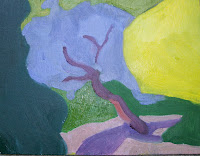
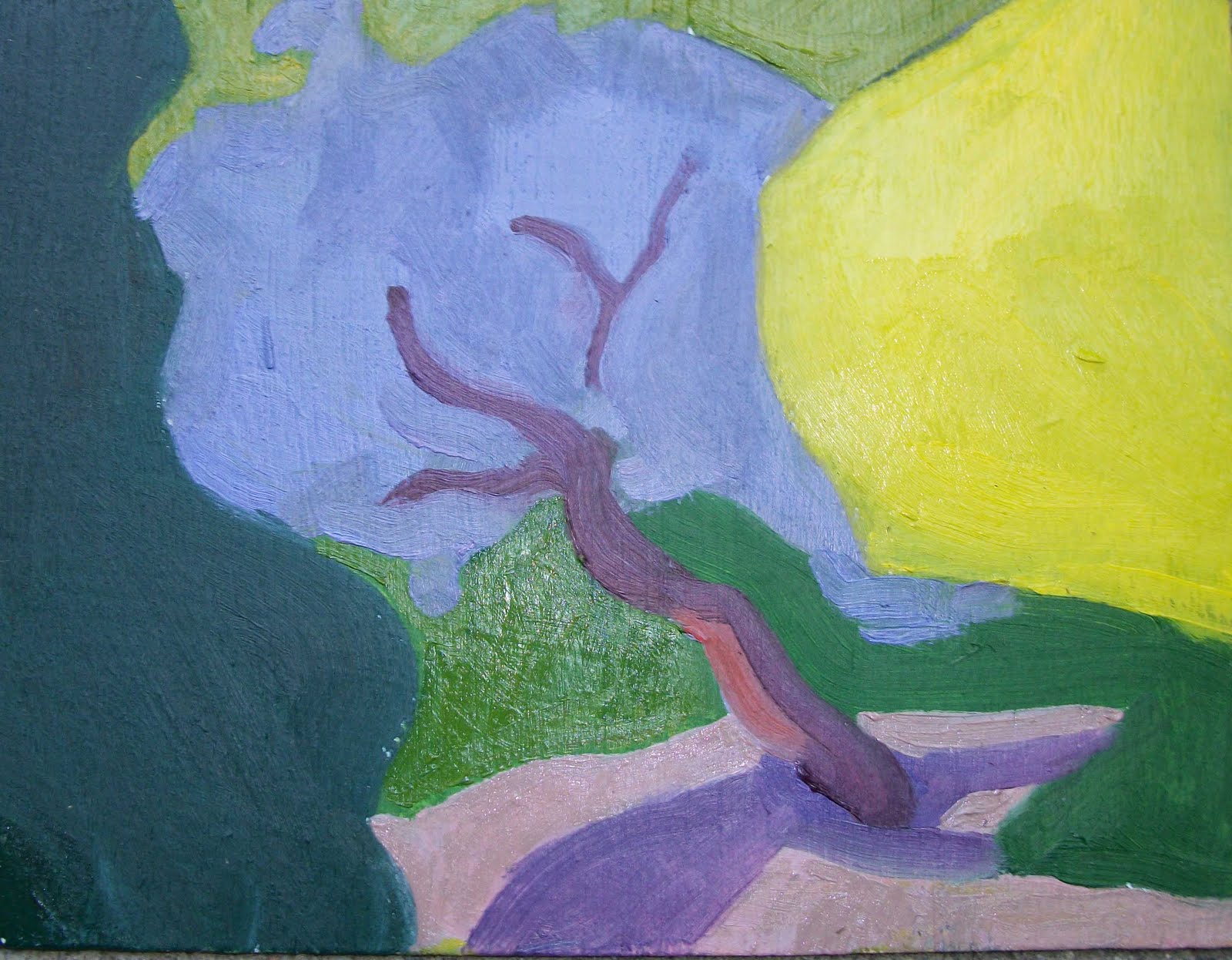
I feel like this one looks like there is a corn dog in the foreground.


 These are from some photos I took at Diaz Lake when I was on the Manzanar Workshop. These are #25, 26 and 27.


 These were done in Village Green between May 19th and May 26th.
 This is not reading well.
 I think this one is more on track.
 This is one of my favorites so far.
 This is not reading well.
 I did these May 20th at the Los Angeles Arboretum.
 This is one of my favorites.
 I am indifferent to this one.
 I feel like this one looks like there is a corn dog in the foreground.


 Push the Color. Paintings are about light. Take what’s infront of yyou. Look at dynamic relationships and find out what’s going on Look what the range is.


 Burnt Sienna is a black orange


 The Goal of the Color Boot camp is 25 to 30 paintings in 5 days. Not interested in rendered images. Must paint what is important first. The idea is assessing relationships. What are you looking at? Eliminate naming generic items. Look for Basic spots of color.


 Burnt Umber Washes


